• If you haven't done so already, please add a location to your profile. This helps when people are trying to assist you, suggest resources, etc. Thanks (Click the "X" to the top right of this message to disable it)

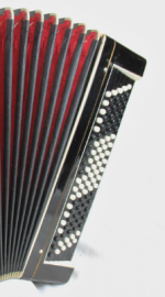
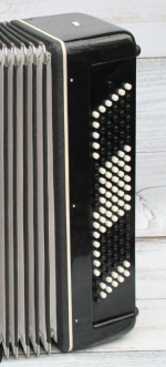
Single vs two colors of CBA buttons

stickista

Well-known member
Joined
Jan 5, 2019
Messages
304
Reaction score
293
Location
SF Bay Area
I’ve come to the opinion that having piano-style white and black buttons on a CBA is almost completely for the benefit of the audience. The player navigates purely by touch (marked buttons) or muscle memory.
Bi-color on the other hand communicates to the audience, particularly those unfamiliar with CBA, at least the concept that the layout is somehow related to piano.
The only times I actually look at my hands is if I’m sitting piano-style at my CBA midi controller.
Only with uni-colored buttons have I had people remark that it looks like I’m playing a typewriter.
 
Last edited:
Bi-color on the other hand communicates to the audience, particularly those unfamiliar with CBA, at least the concept that the layout is somehow related to piano.

Yeah, but isn't it a bit like a magician explaining his tricks to the audience while he's performing them? :unsure:
 
Yeah, but isn't it a bit like a magician explaining his tricks to the audience while he's performing them? :unsure:
I find it dismissive to have people make the ‘typewriter’ analogy.
I feel like their having some sort of reference makes it feel less foreign and a bit more inclusive, particularly in the US
 
Hilariously, I'm getting a lot of vintage typewriter ads being pushed by the likes of Google - I reckon that's AI image recognition picking up the image patterns of "for sale" listings that I keep looking at.
 
I find it dismissive to have people make the ‘typewriter’ analogy.
I feel like their having some sort of reference makes it feel less foreign and a bit more inclusive, particularly in the US
Typewriter analogies seem more fitting for bandonion where so little of the instrument is systematic and left and right hand are doing completely different things (and everything changes between push and draw as well, making it worse than a typewriter which at least has related letters on shift and unshifted, albeit not on numbers and punctuation).
 
Bi-color helps me differentiate between "B" & "C" griffs when watching other players. Otherwise....? I do use cross-top buttons on all my "C's" to help hand locating.
 
Bi-color helps me differentiate between "B" & "C" griffs when watching other players. Otherwise....? I do use cross-top buttons on all my "C's" to help hand locating.
Agreed. And again, the player knows if they’re C or B. the benefit is to the audience.
 
I like the look of the black and white buttons, but as real accordion players never look down at the keyboard while playing they only serve as a visually pleasing display and have no actual function to the player. However, I really need the textured keys as a point of reference. I have one accordion with all white buttons (a Hohner, with A, C# and G# textured...) and on that one the white "black" buttons have a small black dot on the side (not visible to the audience) so as to serve the players who do need to look down at the keyboard.
 
Honestly, do you whatever you want and ignore all gatekeeping or stigma about this issue. I've heard one teacher call the black/white buttons a "crutch," which is simply ridiculous. Orchestra musicians in countries where CBA is played classically use black/white layouts without a second thought. The monochrome buttons have "braille" position markers anyhow. I have accordions with both. Truly, who cares.
 
I do find the black and white marking helpfull.
A surreptitious glance down shows the start position before playing a tune. After that I don't need to look at the keyboard.
I find, as I get (got) older my fingertips are less sensitive and I can't always locate the marked buttons
As an aside, why have black and white keys on a piano or piano accordion?
Surely the same applies.
 
How about the bass side of the accordion? Many Bayan accordions also color the bass buttons to indicate whether the bass note or root of a chord is a black or white note. I presume the idea here is that if you are going do this on the treble side, why not also the bass for consistency? However, I don't see how it serves any purpose to either the accordionist or an audience, and the geometric pattern looks weird to me.

1743351639577.png
It tells us that the Russians consider G-B♭-E not a kind of Gdim but rather a kind of C7. Any images of 6-row black-and-white bayan basses around?
 
Back
Top